Beer Roger
LABELS AND BRAND IDENTITY
CLIENT: Brewery Grádo
The purpose was to promote wider awareness of the Roger brand and to inspire a visual connection with customers and potential customers Roger brand. This was necessary to visually differentiate the brand from competing brands and, last but not least, to separate the public perception of the Roger brand from the original Grado brewery brand. The design needed to convey a sense of premium product, of quality. But not pompous luxury.
Beer will be on tap and on the shelves of supermarket chains. The marketing touchpoints are local banners (places where Roger beer is tapped) and social media sites.
KEY WORDS
visibility – dynamism – tradition – quality
LOGO
The Roger Brewery logo consists of a cartoon bull’s head and the handwritten name of the brewery,
accompanied by the date of its foundation.
The bull is the inseparable mascot of the brand and should therefore be the most memorable visual element
even among competitors.
The logo evokes the tradition and craft of beer production combined with modern comic styling. The result is a style that is currently
not found in any brand on the Czech market at the present time.
![]()
It is often necessary to use the logo in different visual contexts. So, of course, there are
four colour combinations and a black and white variant, functioning as a sticker would.

![]()
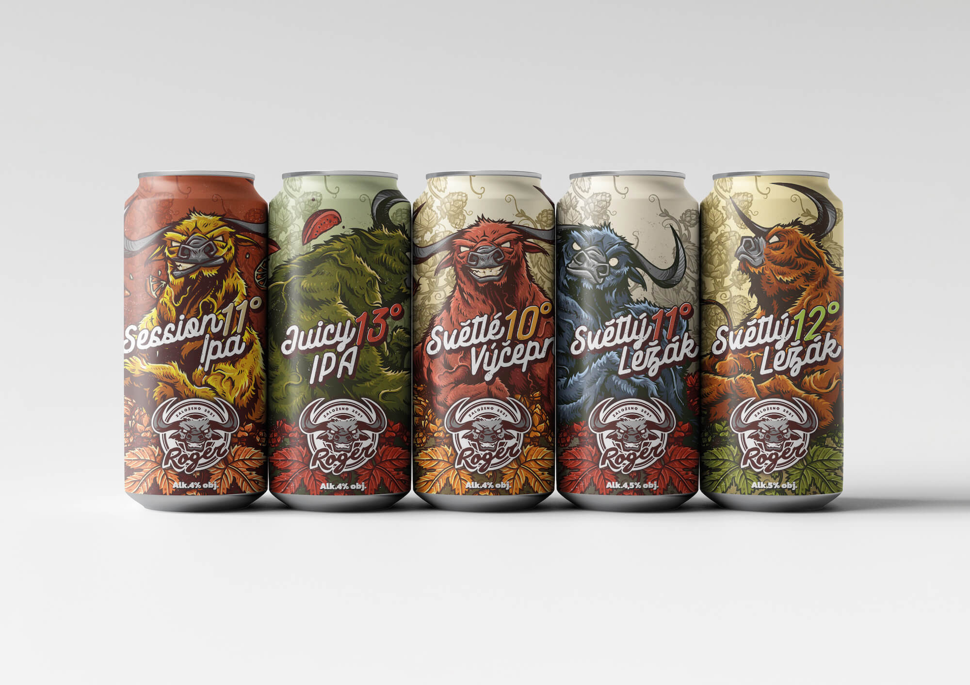
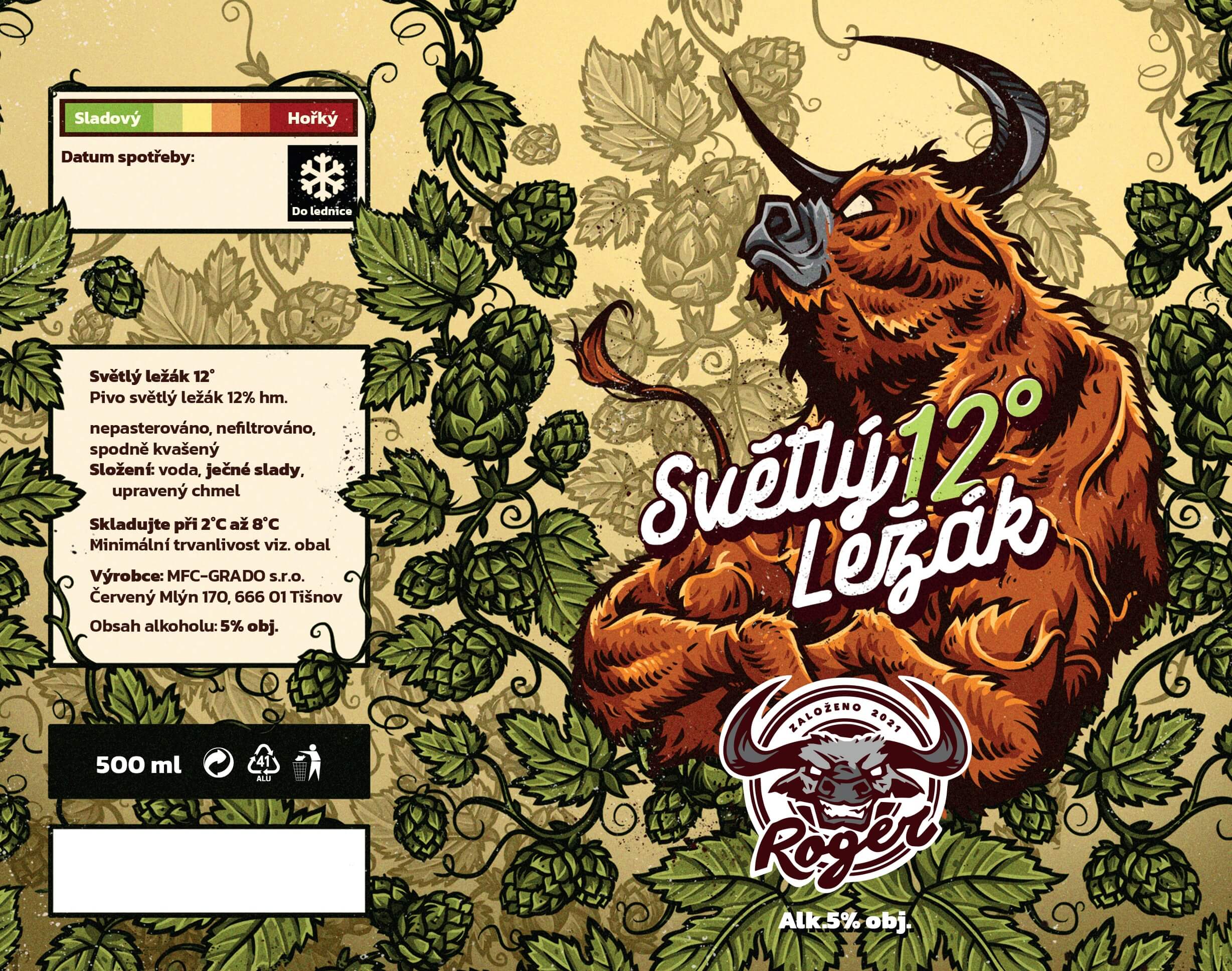
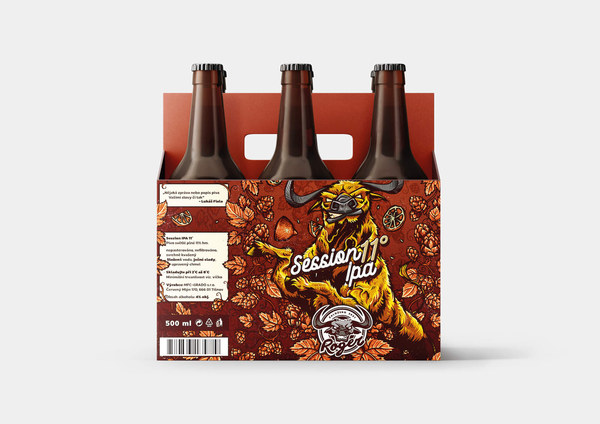
LABELS
We create a logo, we create an identity. But it’s really all about labels. Because labels are
the main visual element for sales and marketing. The nicer the product, the easier to do business with.
Each label has a single mascot. However, to avoid repetition of visuals, the bull always takes a different pose on the labels.
To make the different beers more distinguishable, each label has its own distinctive colour palette.
However, they all reflect a uniform drawing style and overall styling.


KEY VISUAL
Apart from the logo, the key visual serves as the main and universal communication element for printed materials,
online space, social media and the web. Compared to the logo, it is more distinctive
and in certain cases much more eye-catching.
The bull is the main connecting motif of the brand communication.
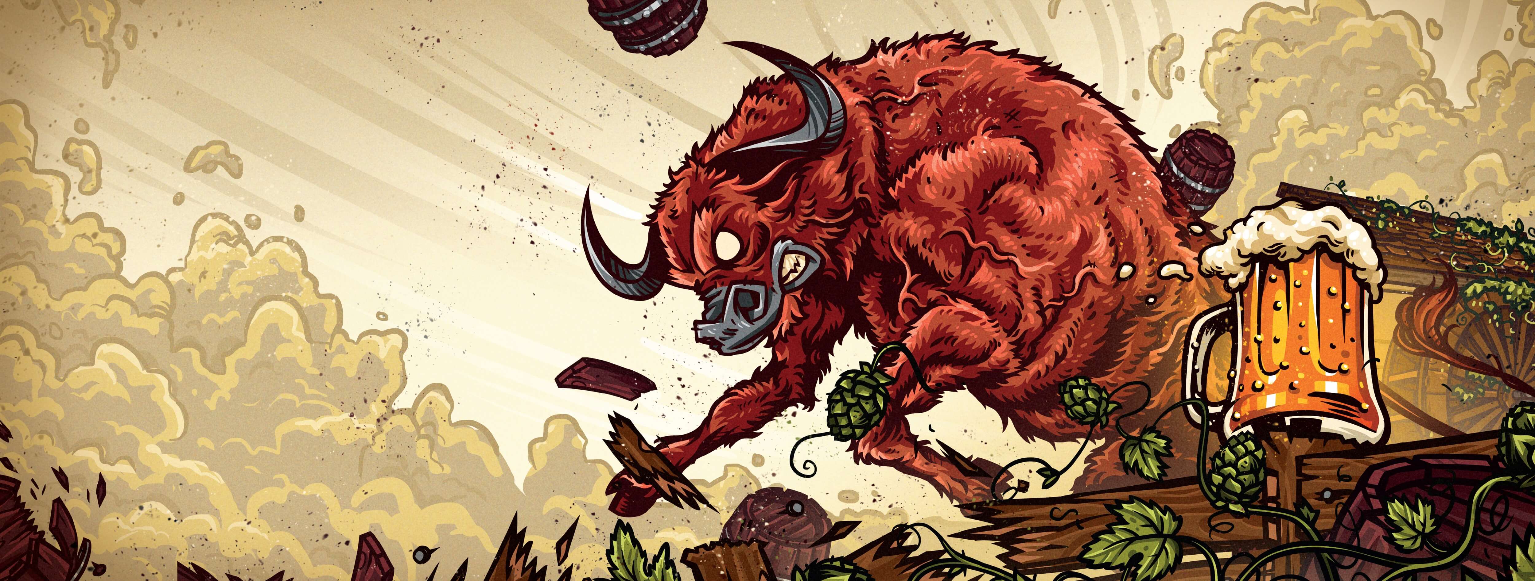
The key visual was used for social media covers and as the main promotional campaign post for the product.
The main motif is the brand’s mascot, the bull, which also appears in the logo. In addition to the tradition linking the bull to the brewery, we see it as
as dynamic, strong and distinctive. These are qualities that also characterise the Roger brand.
With its strength and expressiveness, it draws attention in a dynamic pose. It also includes a pint of beer, which clearly evokes for the viewer of the banner,
which segment of the sale is being targeted. Last but not least, there is the motif of the mill, which is a characteristic element of the original building,
which is now the Roger brewery. A complementary element is the green hops characteristic of beer production.

LOGO MANUAL
Of course, a logo manual is also a prerequisite for setting the visual identity. In addition to most of the basic elements
such as the use of the logo, its types, colors, fonts we also create pages with the application of our illustrations.
On request, we provide clients with an audit or professional supervision for the implementation of the visual identity publicly and in campaigns.
![]()
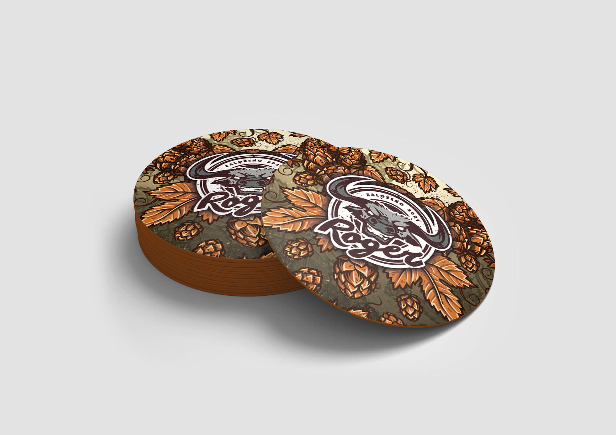
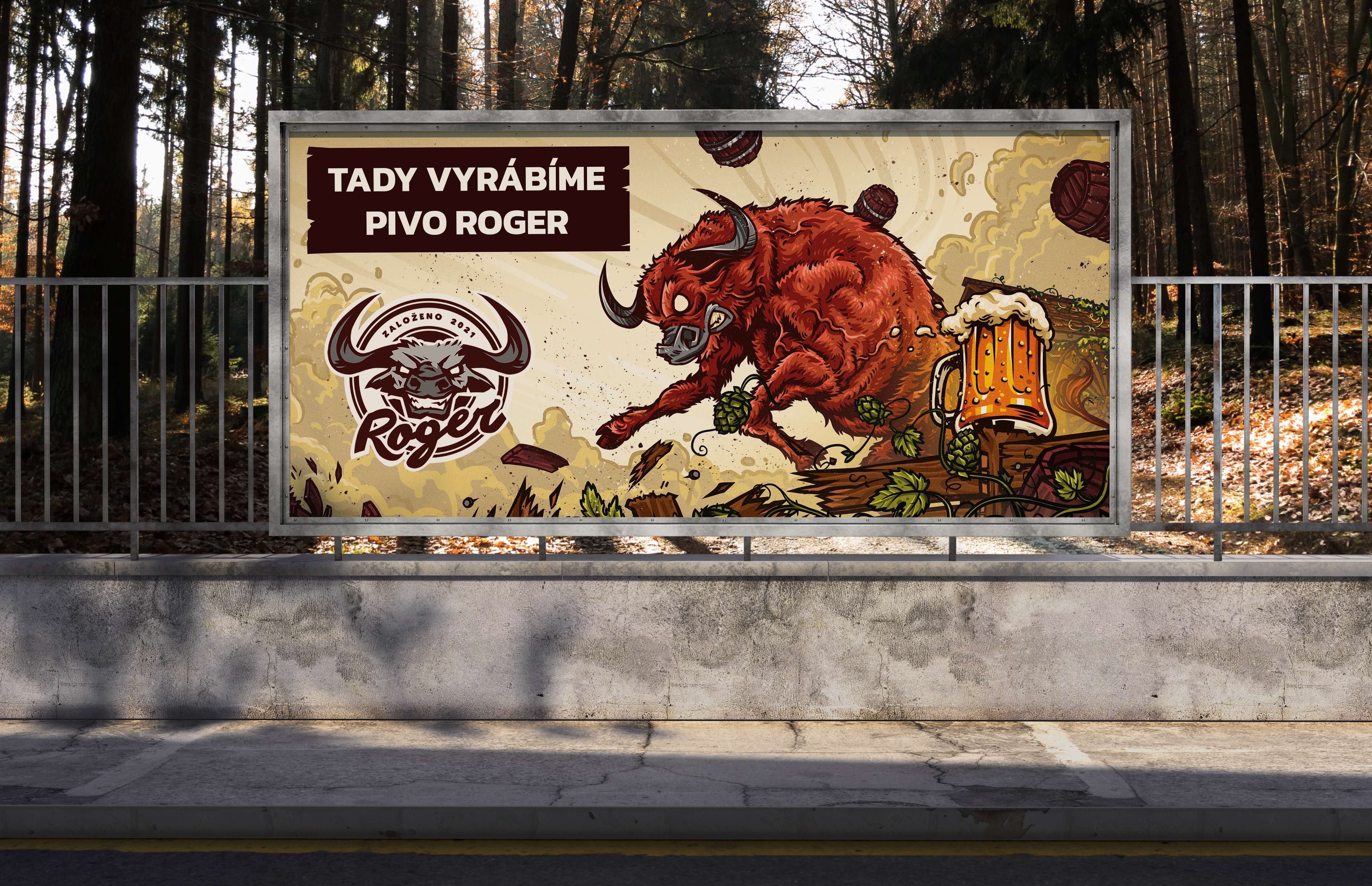
FURTHER APPLICATION
Once the visuals are processed, it is relatively easy to think of further uses in the form of recycling.
Typical beer coasters of different motifs or a signboard are an easy solution.