This is an unrealised concept for a visual re-design of the brand.
The aim of the commission was to design an evolutionary refresh of the brand and unify its various sub-brands, which were not perceived by customers as part of the Hranipex family. The brand is associated with artisanal handwork across disciplines. The main target group was the joiner. So we moved away from the plans and sketches that a joiner might draw in his hand. We decided to go with a cartoon-like styling that evokes handwork because of its roughness and imperfection.
![]()
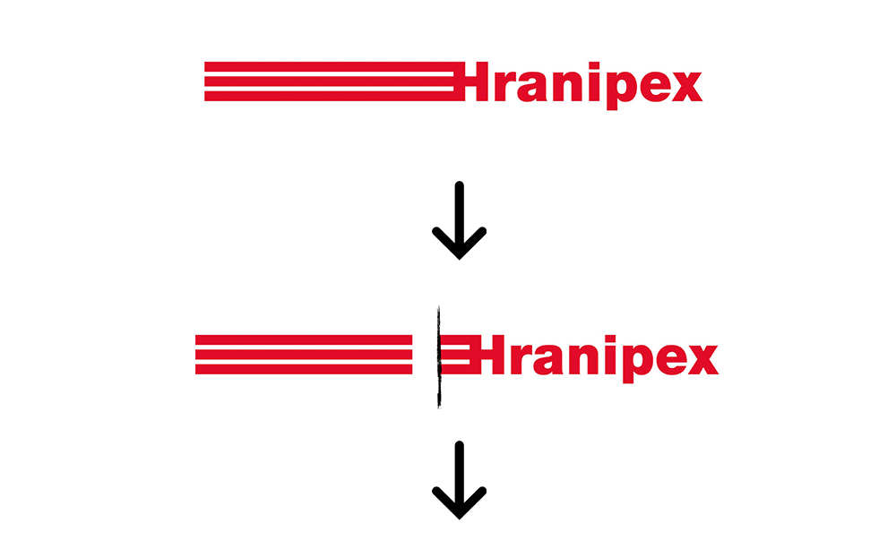
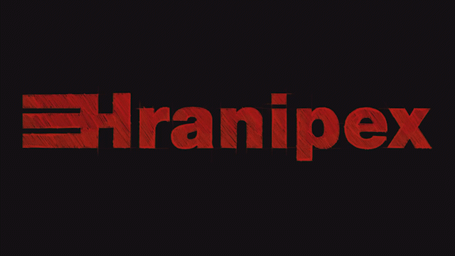
First, we separated the long part of the logo to keep the distinctive fork shape that existing customers are familiar with, but removed the Following the suggested styling, we redrew the logo by hand. With hatching and auxiliary sketch lines, we tried to evoke a connection to the joiner’s sketches. Finally, we sat the logo on a dark background to enhance the impression of a quality and premium brand.
Negative logo variant

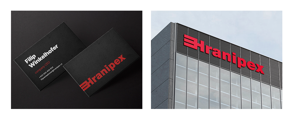
Sample of a possible application
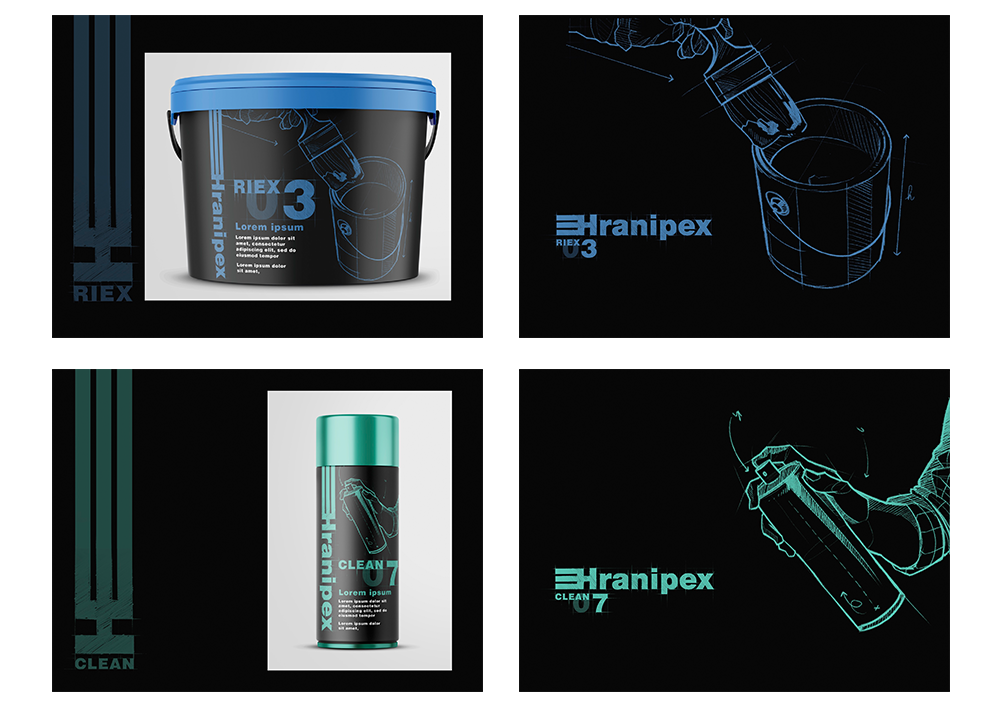
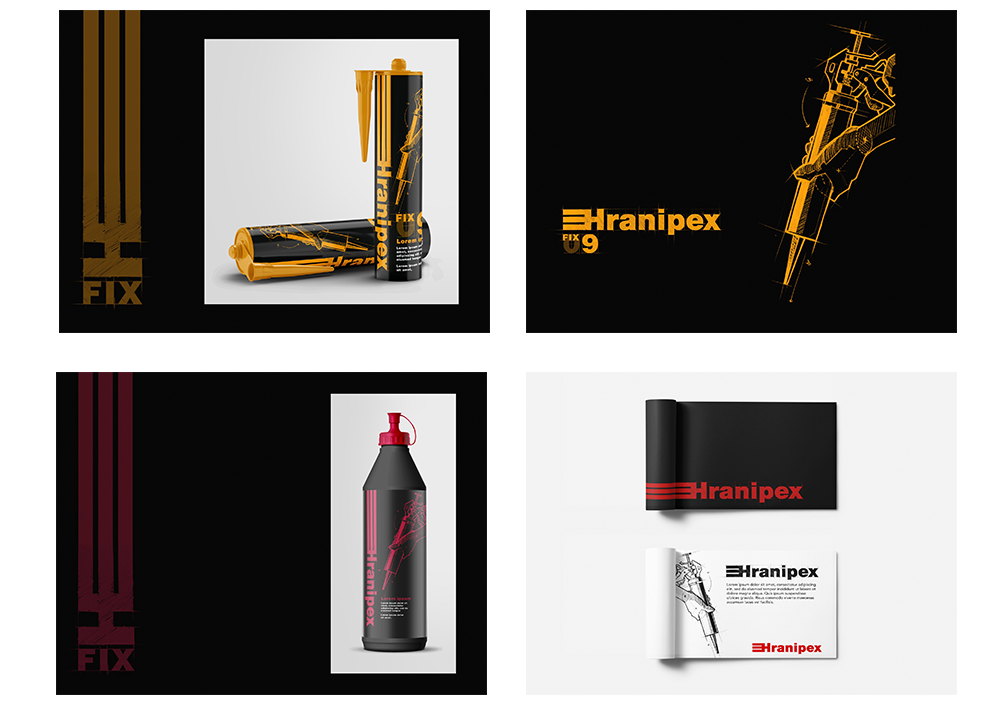
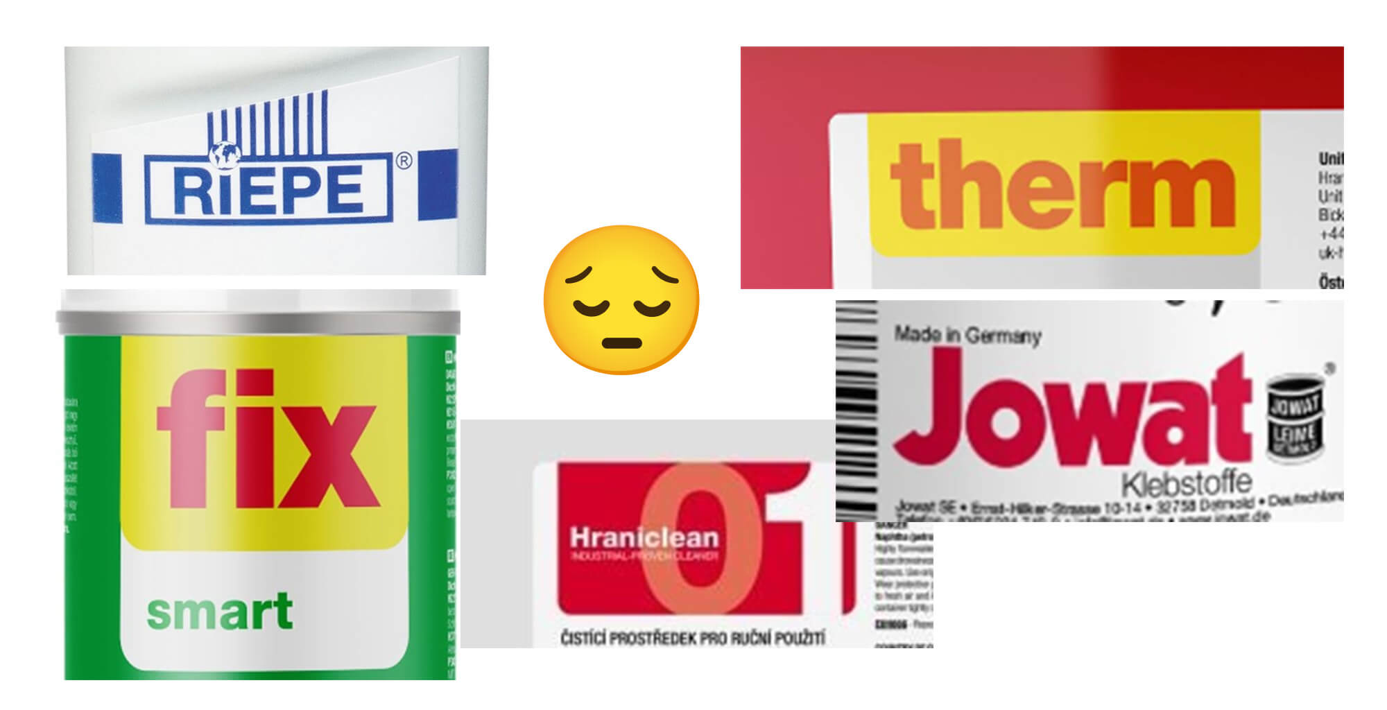
One of the tasks was to unify the Hranipex sub-brands. As can be seen, the individual logos were treated differently each time due to their gradual emergence over time, regardless of the consistency and complexity of the family. Probably anyone would have had a hard time understanding the consistency due to the disunity of colors and visual elements.

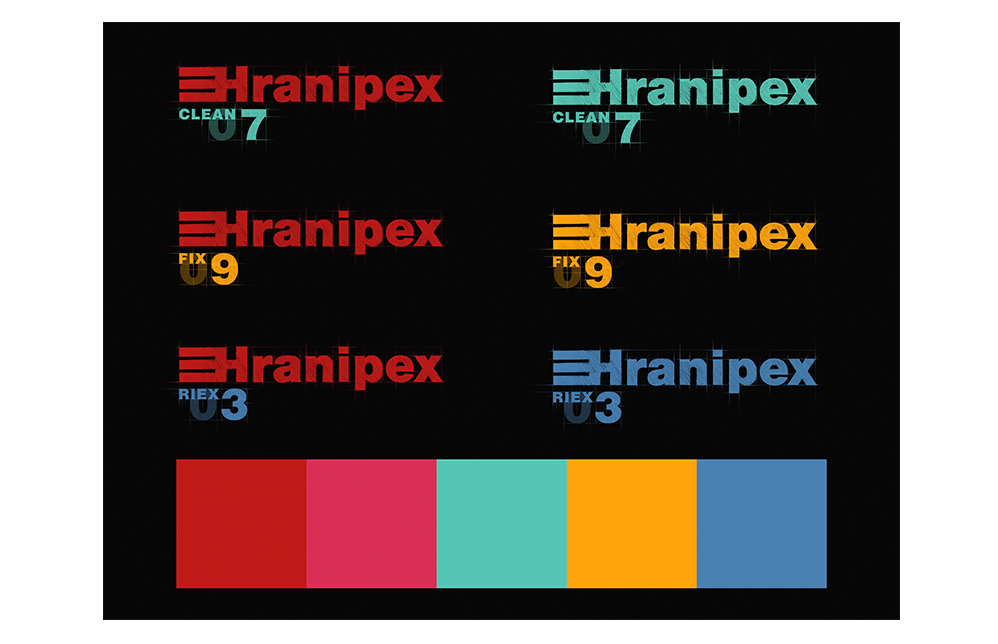
Our solution. Complementary colour differentiation of individual brands while maintaining a consistent visual style taken from the overarching visual identity of Hranipex.
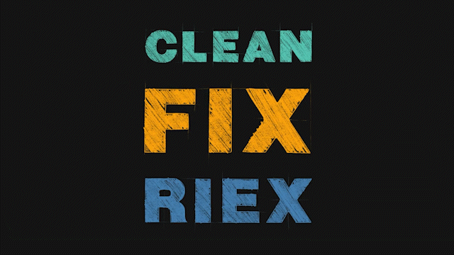
To support the distinctiveness and recognition of the individual sub-brands and their products, we have added illustrations. The illustrations were developed with the same intention and connection to the craft as the logo. That is to say, a distinctive sketchy stylization of the drawing, including hatching and auxiliary lines.