The company’s 20th anniversary on the market is a significant milestone that deserves to be supported by strong visual communication. In the case of Sprinx, we created a mascot to accompany the company’s history both online and in the company’s upcoming event.

First, we proposed two variants of styling. One more cartoony and the other more realistic. In the end, we leaned towards the second option, which is more suited to the client’s character. The colors were based on the brand palette, or the logo.

Subsequently, the mascot was finalized and processed into many positions that can communicate and present the necessary information much more easily than a simple and boring text would. Not to mention the event gimmick of “taking photos with the mascot”.


In this case, we created dozens of illustrations for use on a website that mapped the client’s years of history on an online timeline.


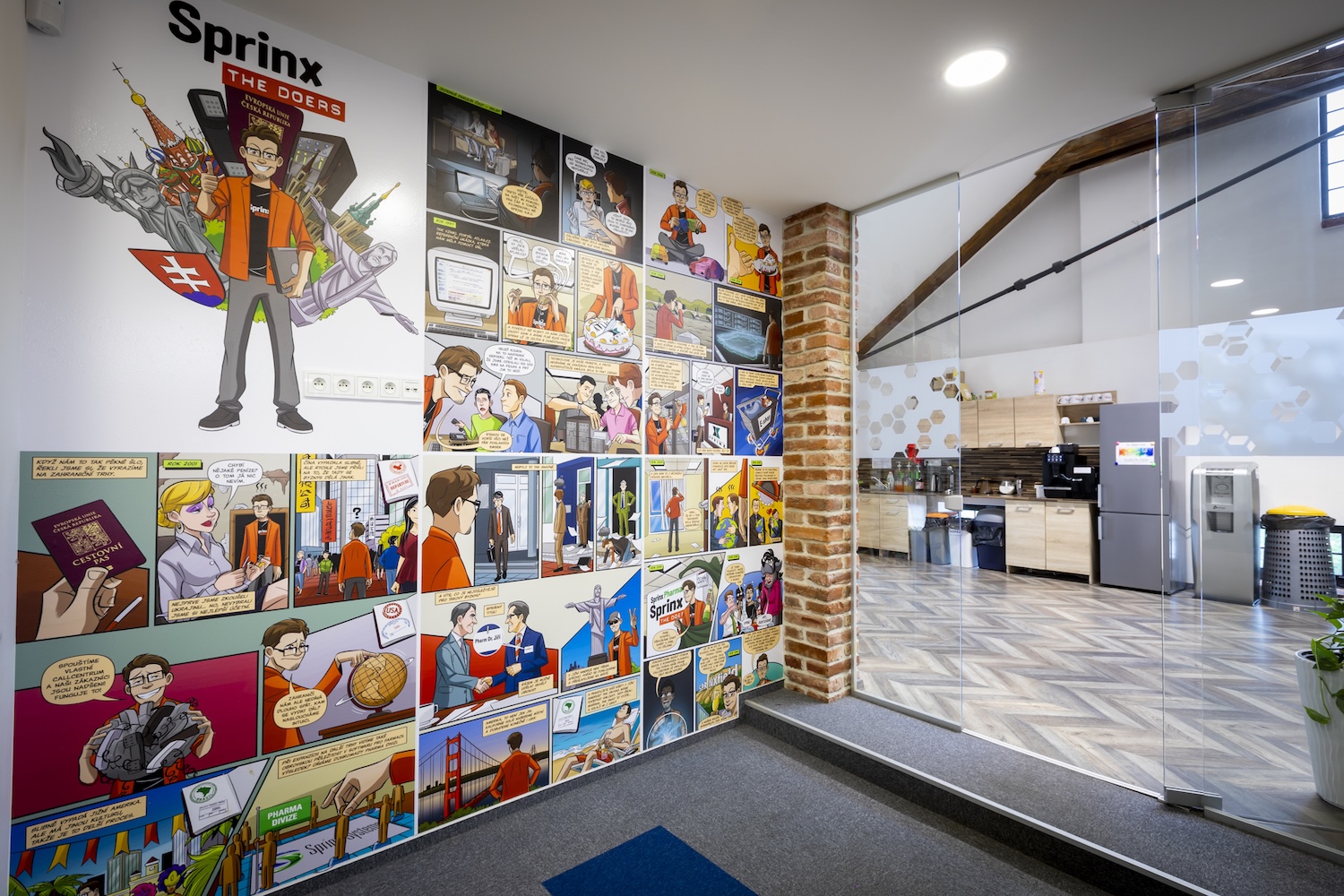
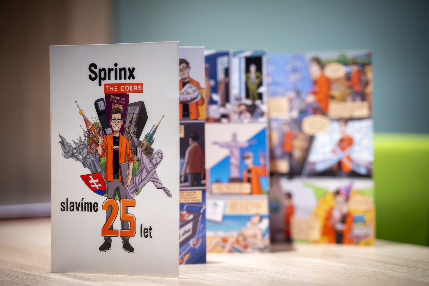
In addition, the mascot served as a comic guide to bring the client’s history to its partners in print….

… and then physically installed at the company’s anniversary celebration event….

… and eventually on the wall of the corporate offices….